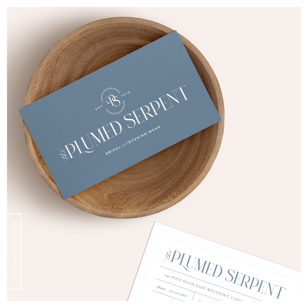
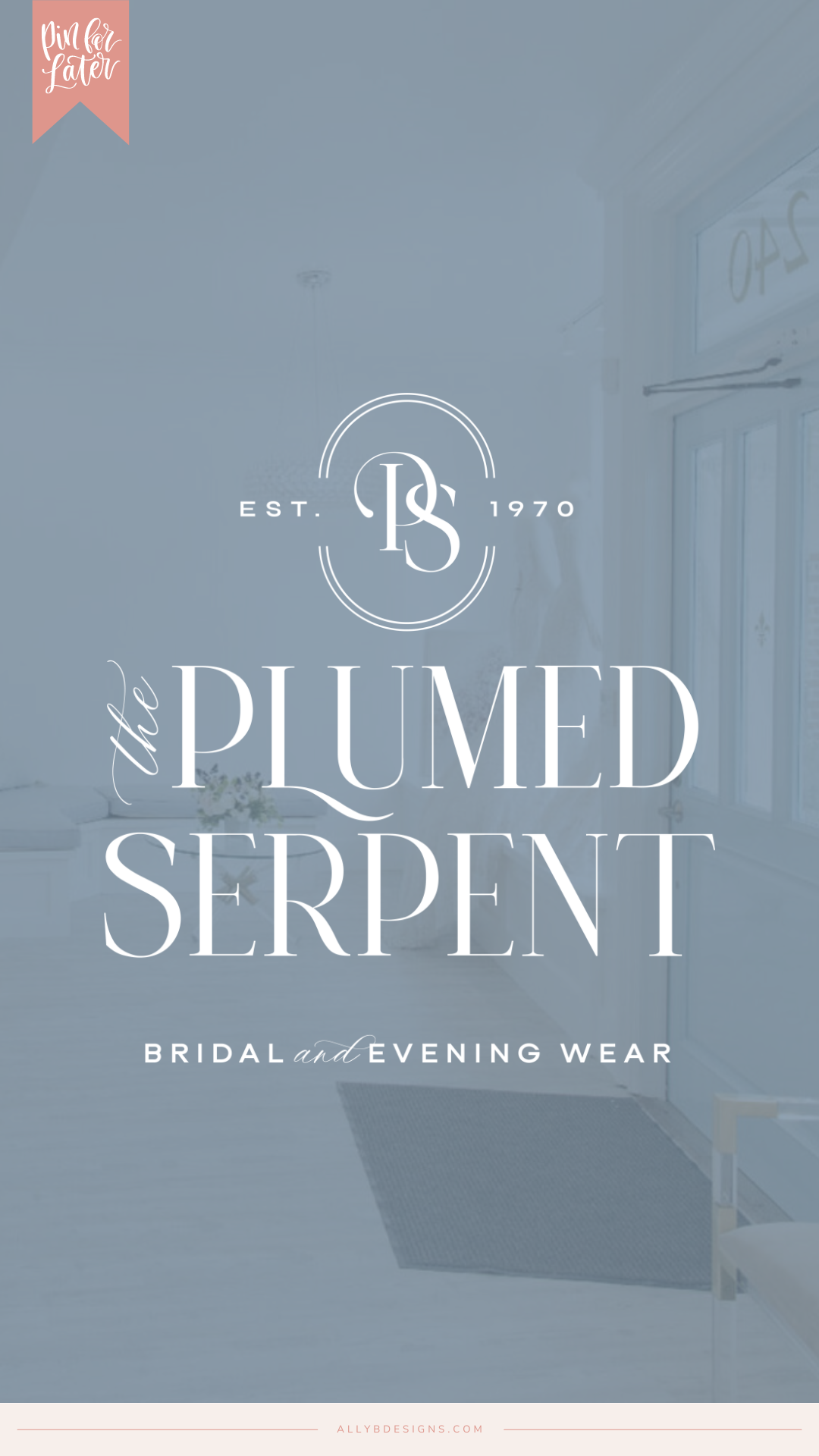
The Plumed Serpent has been a longstanding bridal store and was ready for a new launch. So we set out to design a new bridal boutique logo.
The owner, Allison, reached out to me when they were in the process of rebuilding their store after a fire. They were hoping for a new brand, and they had hired a team to work on their website but wanted to have a strong foundation.
Allison was referred to us by our client Emmy with Blush Bridal and Refined Bridal Boutique Co., and I knew this was a project I was going to love.
Allison mentioned that her business was well-known, but she never felt that the visuals were given enough love.
Allison is an amazing, driven businesswoman whose bridal store has a great reputation.
We needed to create an elevated brand to match the level of service she provided to her high-end clientele.
One thing I LOVED about Allison is her product knowledge. She doesn’t just say a gown she carries is a lace gown. She’ll tell you it has layers of Chantilly, Alencon, and Lyon lace. And that Alencon lace is from France whereas Guipure lace is from Italy, and do you see the difference?
In the same way that her vast product knowledge differentiates her company, my goal was to help differentiate her branding.
The brand package that I put together for The Plumed Serpent included:
- The Brand Foundation and Brand Identity Design
- Brand Stationery
- Email Signatures
Step 01. The Brand Foundation and Bridal Boutique Logo Design
Allison wanted The Plumed Serpent’s branding to be instantly recognizable to everyone.
She wanted her brides to feel happy, impressed, excited, and curious when engaging with her brand.
When creating the branding, we kept her goals at the forefront of our creative process.
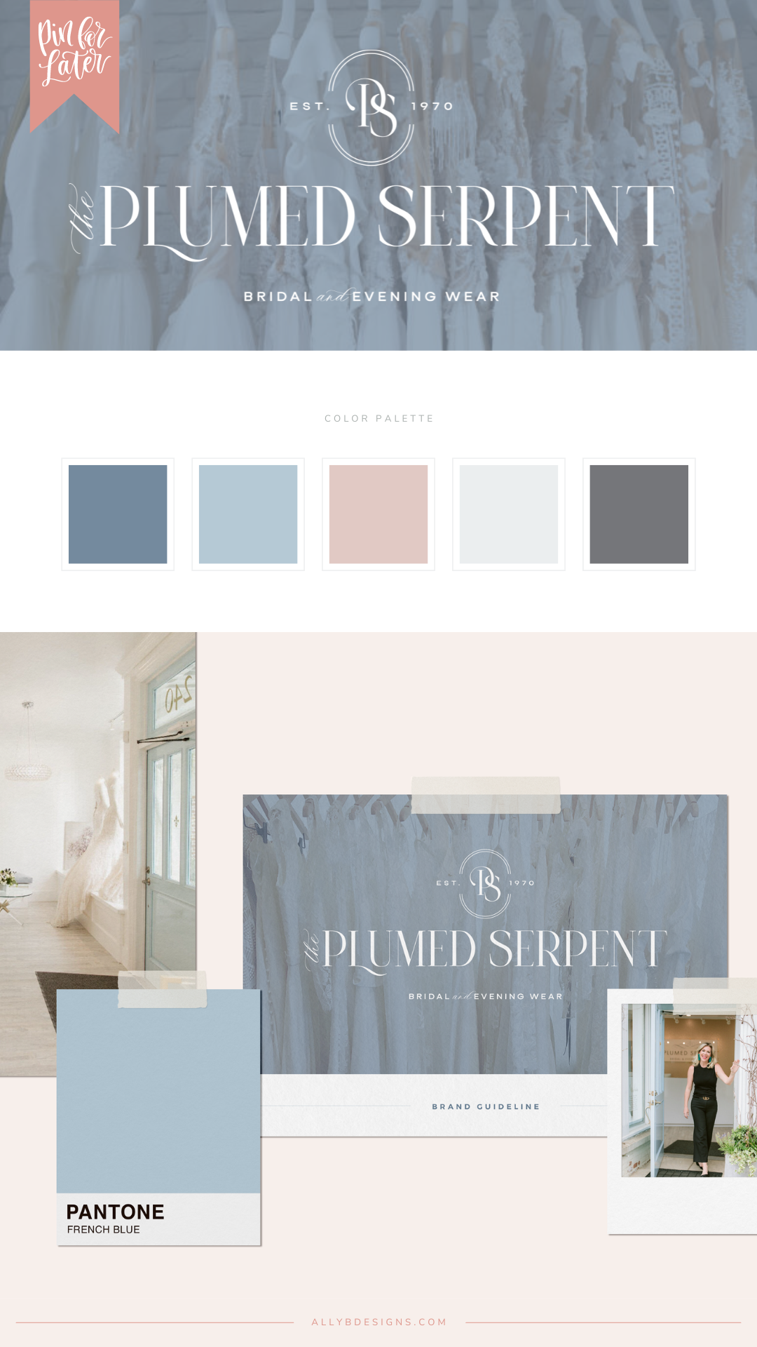
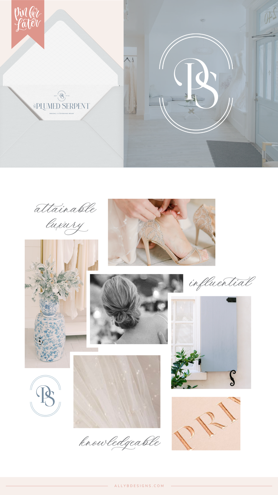
Some of the words that guided us were: attainable luxury, knowledgeable, and influential. These were all well-established components of her current brand reputation that we needed to infuse into her new branding.
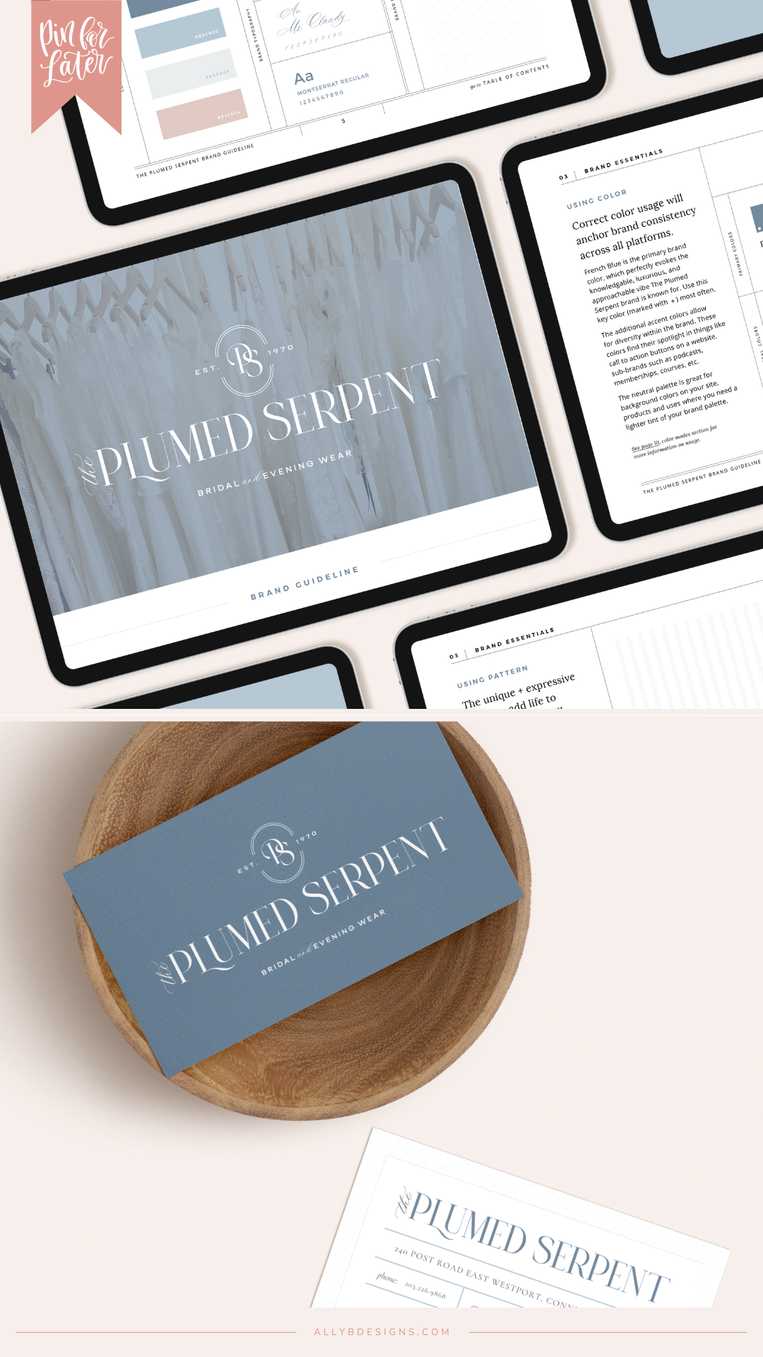
For The Plumed Serpent’s brand colors, we chose: French Blue, Sky, Petal, Gunmetal, Whisp, and White.
For the branding elements, we included subtle lined and criss-cross patterns.

Step 02. Marketing Materials and Brand Collateral
Marketing materials are always one of my favorite things to design because we get to carry the branding forward. We can pull in the brand patterns and play with the brand colors in fun ways.
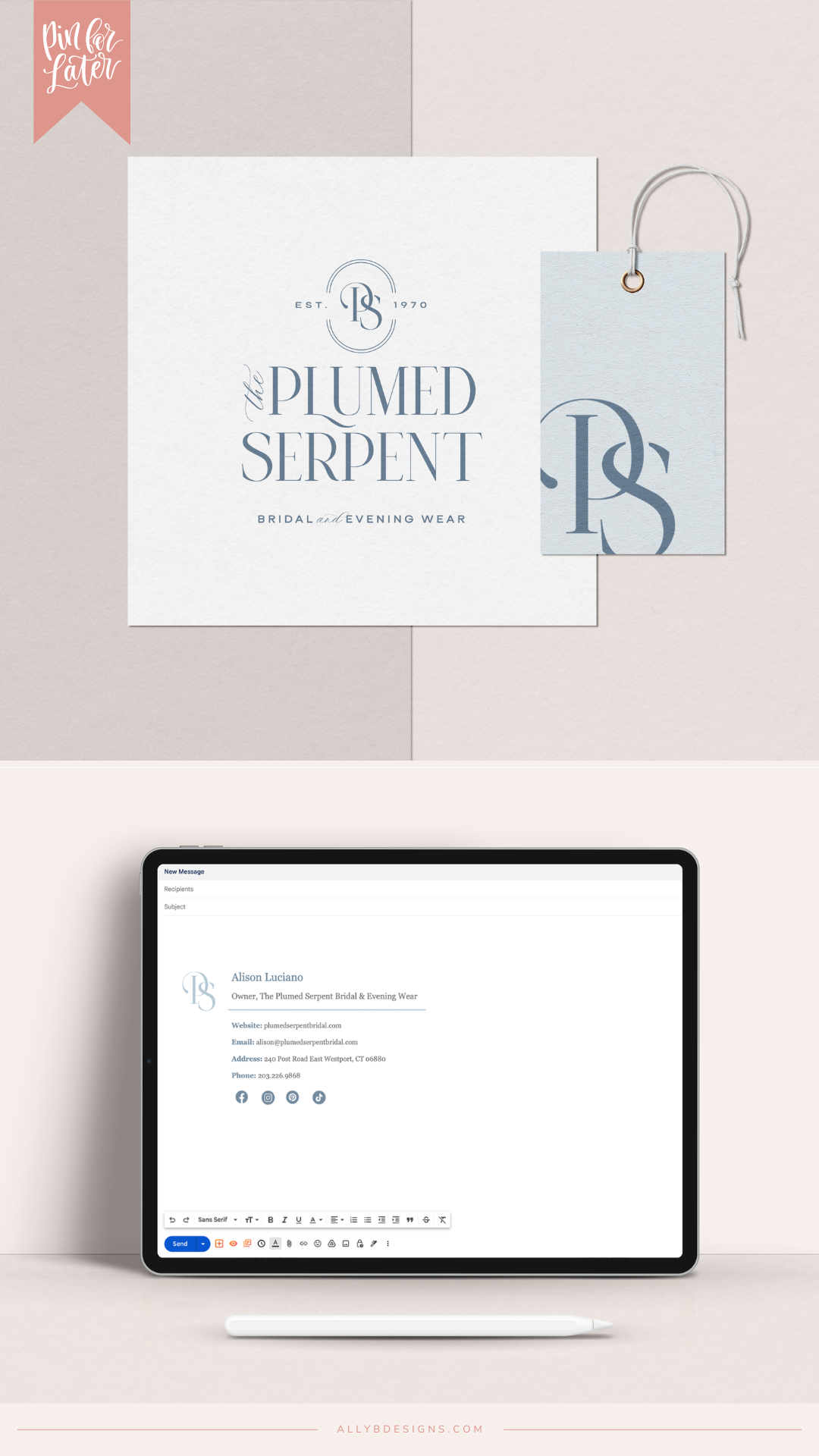
For The Plumed Serpent, we created business cards, thank you cards, tags, and email signatures for her team.
This allowed us to carry her branding to both print and digital mediums.
I tell my clients that every touchpoint of their client experience should be branded, and Allison is all about elevating client touchpoints throughout their online presence, marketing materials, and at their boutique.
could your website be next?
A pretty and cohesive brand is what every business owner needs, but it’s the strategy that actually gets you more of the right clients that grow your bottom line.
If you are ready to start attracting more of the right clients by hiring us to design a brand that’s as strategic as it is pretty, we want to talk to you! Click the button below and book a call to chat or you can reach out via our contact form here.


