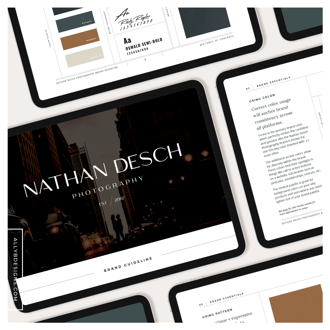
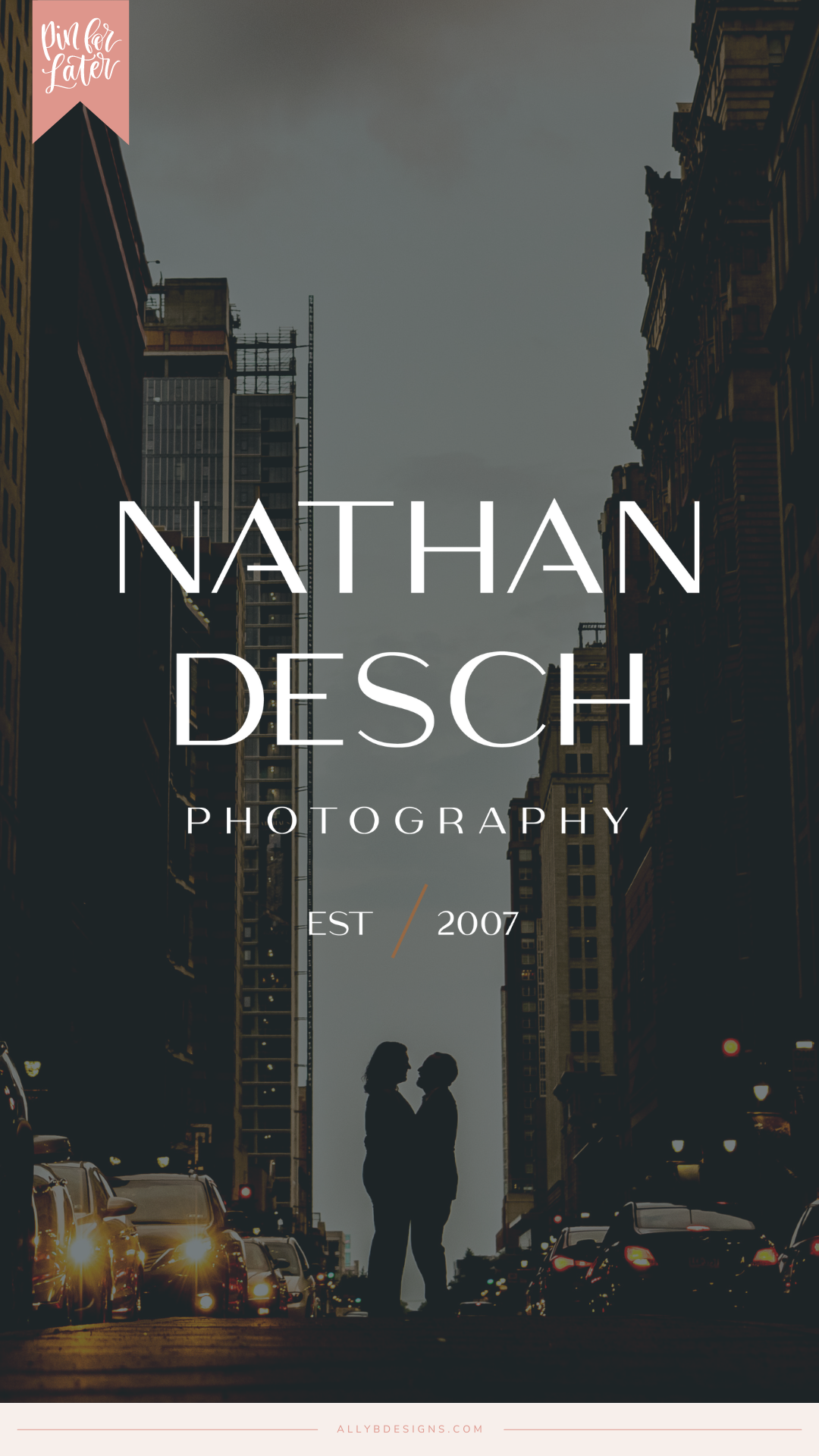
When Nathan Desch Photography reached out, he wanted his photography logo, brand, and website to reflect the same quality of service and care he provides to his couples.
He mentioned his clients choose him because they see the value in the systems he has in place that allows them to enjoy their wedding day. They also really trust him to deliver beautiful photos and an excellent experience.
But, his website wasn’t doing a very good job of attracting leads because the overall impression didn’t match the impression people get when they see his work and actually work with him.
During our brand foundation work together, he told us the values that drive his business are: generosity, curiosity, creativity, hospitality, genuine care, and competence.
Anytime we’re designing a brand and website, we want the clients’ values to shine through, so we designed with those in mind.
The photography logo and custom ShowIt website design package that I put together included the following:
- The Brand Foundation and Brand Identity Design
- Brand Stationery
- Custom ShowIt Website with Professional Copywriting
Step 01. The Brand Foundation and Photography Logo Design
When I read through Nathan’s brand foundation questionnaire, a few things stood out.
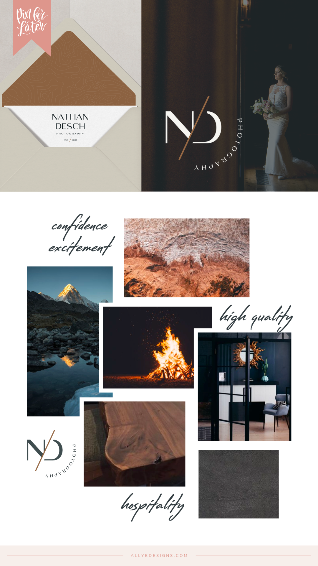
He wanted clients to feel blown away, hopeful, excited, full of anticipation, and confident in their decision when they encountered his brand.
Isn’t that something all of us business owners want?
The look Nathan was going for was something minimalist, intentional, bold, and intuitive.
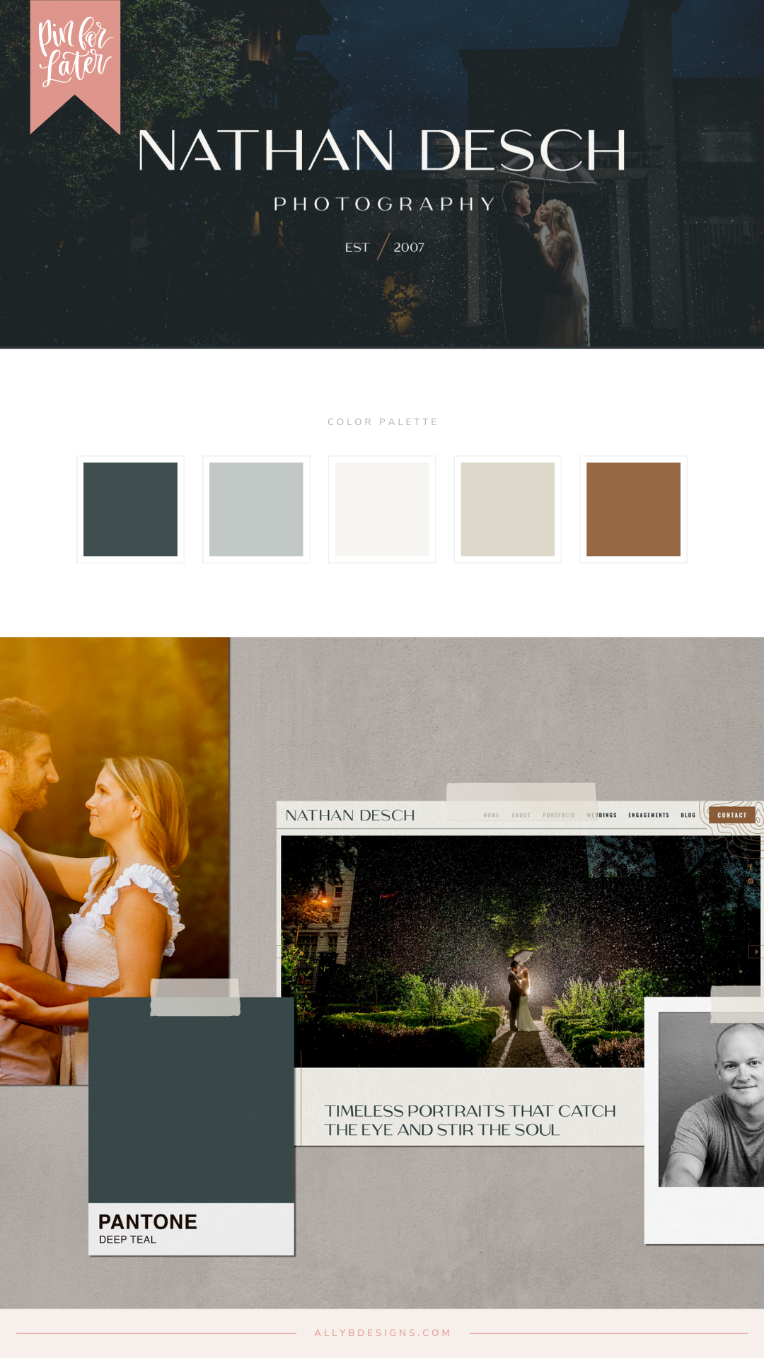
For the brand colors, we chose: Slate, Forest, Cognac, Pine, Suede, and Dust
We also used patterns that had a slate feel and incorporated some modern and minimalist topographic swirl elements to bring through his love of adventure and travel.
Step 02. Marketing Materials and Brand Collateral
With the brand foundation and a strong photography logo in place, business cards were a breeze! We carried the brand through to the business cards, printed them with our high-quality print partner, and had them shipped to the door.

Step 03. Custom ShowIt Website
Next up was designing Nathan’s website. His work is stunning and photography remarkable so we wanted to layout to spotlight that while uplifting the overall aesthetic.
Each page is laid out strategically, enticing customers to continue clicking to learn more. The layout is bold, intuitive, and minimalistic – exactly what he was going for.
It’s easy for prospective clients to imagine themselves working with Nathan because his website demonstrates clear communication, quality service, and talent on every page.
Now, nothing is detracting from that.

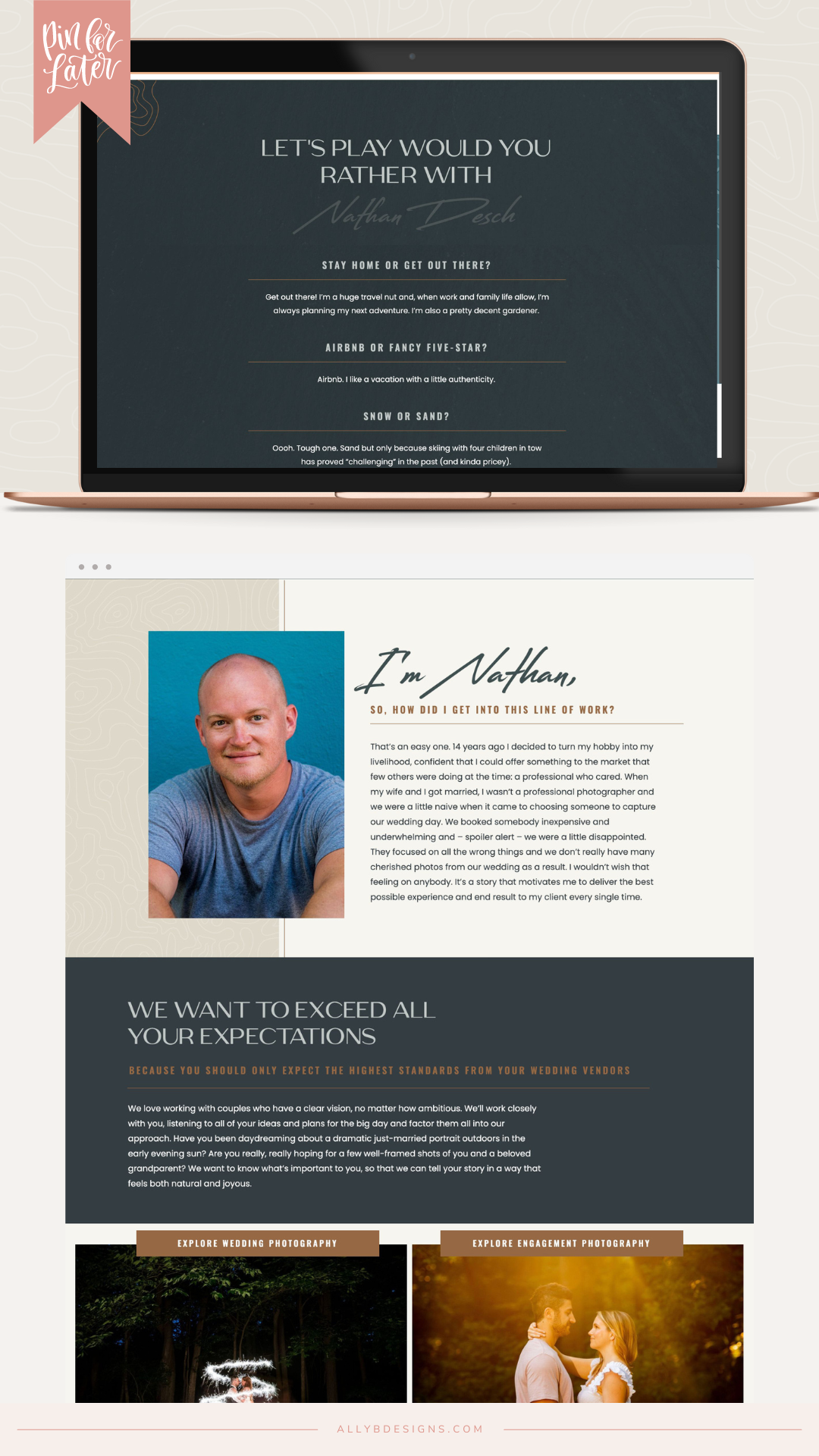
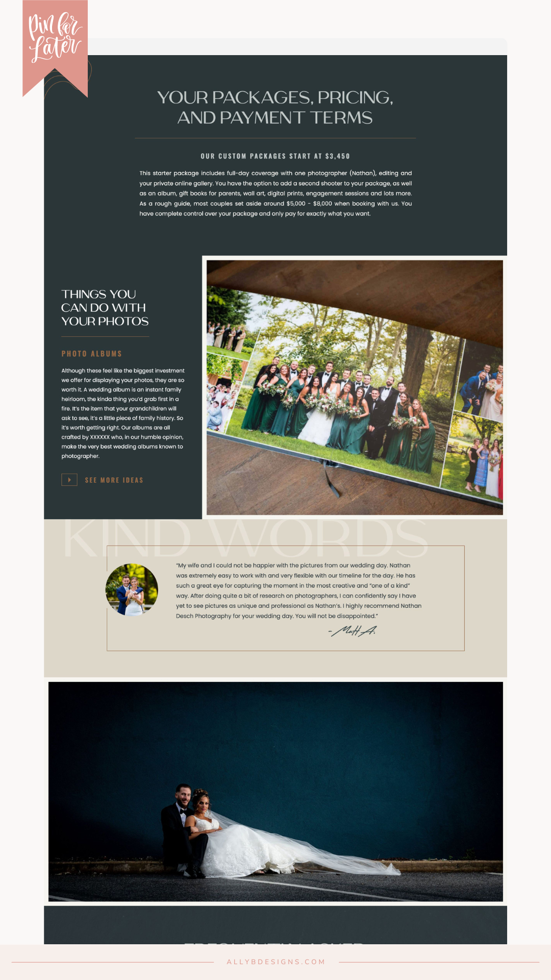


want to see this website in action?
Go ahead and take a spin around, visit the Nathan Desch Photography site here!
This website design has been featured by DesignRush in The Best Web Designs for Photographers on our Best Designs Trends page. Check out this fantastic mention here.
could your website be next?
A pretty and cohesive website is what every business owner needs, but it’s the strategy that actually gets you more of the right clients that grows your bottom line.
If you are ready to start attracting more of the right clients by hiring us to design a brand-focused website that’s as strategic as it is pretty, we want to talk to you!


