Today we are chatting all about how to create a high converting website with a powerhouse experience for your personal brand!
Have you ever gone to a store and seen something you really love and HAVE TO HAVE, but you can’t reach it? You see the perfect shirt that you want to try on, but it’s hanging on a bracket too high for you to reach – even on your tip, tip, tippee toes.
There you are looking around for someone to help you – no one. You look for that long tool with the hook on the end, so you can reach it yourself, but you don’t see that anywhere either.
Uggggh, you get frustrated. This time you jump as high as you can and try to grab the shirt and fling it off of the bracket, but that doesn’t work either.
You give up and walk out of the store. You’re frustrated and even though you want that shirt, you probably won’t go back for it, because by now you are just over it! That’s the worst.
Guys, your website can do that same thing to customers.
You might think you’ve created the most welcoming and attractive space for them, but sometimes we forget about their comfort and how accessible you’ve made yourself and your services and/or products to them.
It could even be that a potential customer comes to your website, but they have no clue how to find what they’re looking for. They just happened upon you and wanted to see more. Maybe they’re looking for something particular, but they don’t know that you offer it (or even what you specialize in).
So, how do you create a high converting website by providing a powerhouse experience that makes it easy for them to find what they’re looking for and actually reach it or reach you?

1. Create a Tagline that Explains Exactly What You Do
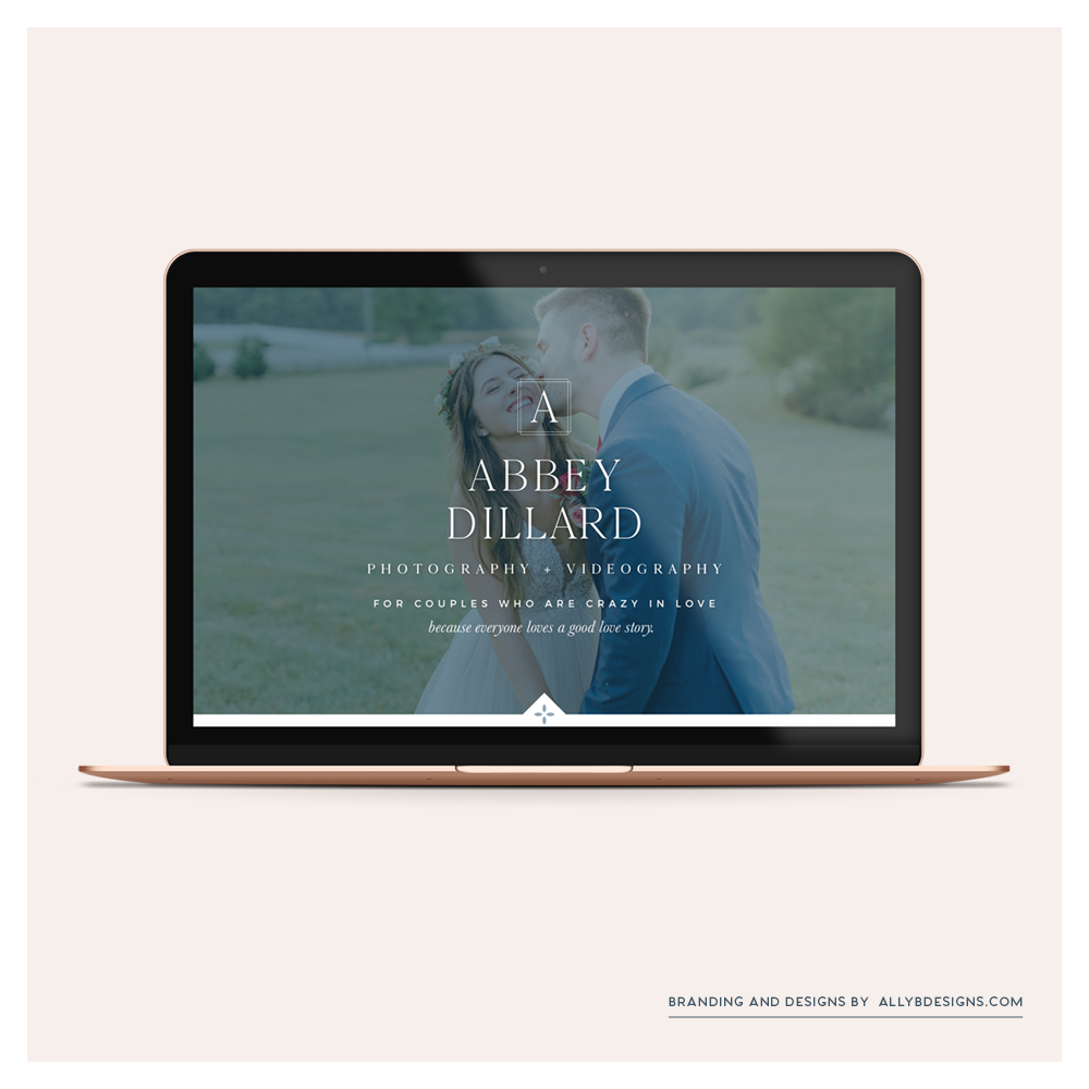
From the moment potential customers land on your homepage, make it clear what you do. Do this by creating a tagline that spells it out or a headline and sub-head at the top of your page on a header image or right below it.
When it comes to explaining what you do with a few words, make sure that it’s clearer than it is creative. You can have a creative and clear statement, but sometimes business owners choose random words (like live, create, inspire) that don’t really give the customer direction.
The name of the game when creating a high converting website is to attract and repel. Be sure to make your home page super clear on WHO it is exactly that you want to work with. I know you might be scared of turning away customers but trust me, you don’t want to work with people just for a paycheck. You will burn out quickly if you try to do it all. If you are doing what you love and loving what you do – shout it from the rooftops and be upfront!

2. Keep Your Navigation Foolproof!
Nothing is more frustrating than landing on a website and not being able to find what you’re looking for or getting confused by all of the menu tabs and sub-menus underneath.
Make a roadmap of your navigation menu that is straight-forward and intuitive.
Because too many pages on the menu bar can be confusing, consider categorizing your navigation into 6 main pages and making dropdowns. If you have tons of pages and content consider moving some pages down to a footer or sidebar.
Recruit the help of a friend or family member. Give them tasks to complete on your website (purchasing an item, finding a blog post, submitting a contact form, etc.). Look over their shoulder and take notes on how easily they are able to find what they’re looking for. This exercise will provide tremendous insight and give you direction on what you need to do to make your website more user-friendly and easier to navigate. If you would rather keep this to yourself – check out HotJar Heatmaps and see for yourself.
3. Have an Inviting About Page
I’ve said it before and I can’t stress it enough – your about page should be just as much about your dream clients as it is about you. Create an inviting about page that draws your dream clients in and then demonstrates how you can help solve their problems and why you’re the right person to do so.
The goal of your about page is for your clients to connect with you to the point that they cannot do anything but contact you. If you want to have a high converting website you have to connect with people. If you want to dig deeper, you can check out a blog post all about it here.

4. Your Services Need to be Clear and Concise
Your website should clearly list only the services that you love to provide and how you can help your customers with their problems. If you have an online shop, it should demonstrate how your products solve a problem or fulfill a need or desire. (Or if they are just the cutest of the cute products – be sure to have amazing photography and creative product listings that make them irresistible!)
If you want to have a high converting website make sure your service descriptions or product descriptions are very clear, informative, and demonstrate your unique selling proposition. If your potential clients still have questions about what you offer and what is included you have probably missed the mark. If you can answer all of their questions and make the booking or buying process so easy. This is where you start your

5. Galleries and Portfolios
Showcase your past work and highlight the best of the best. You want to only show what you love doing and what you want to offer. What you put in your portfolio is what people will be drawn to. So be sure if you include a shoot or a past design, it is something you would want to and be excited to do again and again.
It isn’t about the numbers, it is about the quality of work you showcase. To make sure you have a high converting website you need to make sure every image or portfolio piece you share reinforces your talents and why you are the best choice for your customer. Galleries can provide proof of your client experience and help you demonstrate to your customers that you can back up what you’re talking about on your website.
6. Contact Information
You cannot leave this off! I know, trust me, I hate handing out my phone number or any other private information! But pull up your big girl panties because this is a MUST!
You spend all of your time crafting your high converting website and making it just perfect, but then you forget or chose not to, include all of your contact information. You may have a contact form, but I am begging and pleading with you to at the very least provide an email address you can be reached at.
So many times (for whatever reason), a contact form doesn’t load and then the visitor is left with no way to contact you and nothing to do next. Your contact information can also include social links, a phone number, and any other way you prefer people to contact you.
Are you ready to create your own high converting website with a powerhouse client experience?
If you are ready to jump fully in and create your own high converting website with your “Unforgettable Brand” and have me as your guide, check out my “tailor-made” brand experience service. This is where I take you on an exciting brand adventure starting with your brand foundation. Then we add as much or as little as you’re looking for and what your business needs. This could include brand collateral like welcome packets or stationery, and a website with messaging that attracts your very own dream clients. It is genuinely tailored to your budget and your needs.


