We have heard a million times over “Don’t judge a book by its cover”. But it is SO HARD not to make decisions based on what we are attracted to. While we know deep down we shouldn’t make decisions based on appearance alone. When it comes to your business and creating a successful brand identity – how your potential clients perceive your brand could be the make or break in their decision process.
A first impression is everything – especially when it comes to your brand! People remember the good, the bad, and the ugly. You might be the most talented creative in your given profession but if your branding and website are giving off an unprofessional vibe your potential dreamies are going to have a harder time committing to your business because they might not trust you.
As a creative, whether it be online or in person, when our brand and website create a connection with our potential clients they feel like they can trust us and that right there leads to more bookings! Hip Hip Hooray!
This all starts with having a brand identity that is unique to you and creates visual recognition. You need to have that “Unforgettable” factor. It has to feel professional, put together, and be enticing. Having a logo unique to you and is memorable will make you stand out from any competition you might be up against. No pressure right?

So I am going to share with you my 5 Tips for a Successful Brand Logo Design so you make a great first impression!
I have had many inquiries pop into my inbox where potential clients are wanting a new website because they believe that this will “fix” their booking issue.
It’s what has been getting in the way of them being the successful entrepreneur they have dreamed of being and have been working so darn hard at. So off I go to collect a little intel on them before I hit reply. Almost every single time, I am blown away by their talent and what they have to offer but I am completely put off by their logo and branding.
Okay, okay, you might be sitting there thinking – but you are a designer – of course, you are going to find something wrong with the branding that I designed myself. But that’s not true. What I am put off by in most of my client research is that the logo design is hard to read. It has WAY too much going on, and sometimes it just doesn’t make any sense.
So there I am on the website of my potential client staring at a bad logo. I try to shake it off and continue on with my research. I head over to Instagram to get a feel of who they are. When go to type in their business name and well “Crap!” I don’t even remember who I am searching for.
Whoops! I couldn’t remember the name of their business because their logo was so Crazy Pants that it distracted me.
Then I go down the rabbit hole of social media and there go the next 30 minutes of my life. (That might be dramatic – I do try to focus on the task at hand but you know how easy this can happen.)
Do you see how this can be a problem when potential clients are searching for just the right person to work with? Of course, they are going to stick with the person who has a professionally presented logo, a branded website that solidifies the deal. They will be blown away when they land on your social media and can get to know you even more! They are going to go with the creative who made a first impression that they just couldn’t get out of their head.
I want to help you do just that!
Let’s dig into how to design a successful brand identity – are your ready?
First, we have to understand that creating an unforgettable logo is so much more than a pretty font and some brand colors.
You want to stand out for all of the right reasons and not create something that is trendy and will last only one season. You want your logo to stand the test of time. The last thing we want to do is create a logo that is based on a font that you are currently crushing on or based on a design trend that is super cool right not.
While I do not believe in branding your business to reflect what you think your potential clients will love, you do need to be intentional about designing a brand identity that they will be attracted to AND that you are personally obsessed with!
It might seem a bit daunting to create a logo that is equal parts your own personal style and attracts clients based on your brand’s mission but I promise you it is possible if you just sit down and do the work. So without further ado here are my top 5 tips:
1. Leave the Past In the Past
I have clients who often want to keep certain parts of their logo be it an image or a specific font because they feel like changing everything might be a bit too much – or that they can save time or money by keeping parts of their brand. I will be the first to admit that change can be hard and scary so I always start by asking my clients “was your current brand working for you before?”.
Most often a change in branding is because you are ready for more and want to take your business to the next level – so my advice is to do it! Don’t hang on to something from the past that wasn’t giving you all you need. If you have made the commitment to rebrand and redesign your logo go all in and don’t hold back.
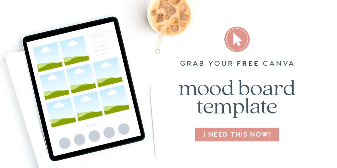
2. Create an Inspiration Board
You might have been dreaming up your new brand for a while but now it’s time to start taking a deeper dive into creating the visual direction your new brand is going to take. You could have some ideas of what you want your logo to look like, however, taking the proper steps to pull inspiration and make sure everything lines up effortlessly. Pinterest is an untapped resource for branding!
We can use it to create phenomenal boards that inspire our brand mood boards and final designs. When we look to it for inspiration have to be very careful we are actually looking for inspiration and NOT to COPY another business’s brand. When we are only looking for inspiration to copy – we’re forced to come up with a B-version of what we’ve found for our own brand. So let me help you, I have a full blog post to help you “Nail Your Brand Inspiration Using Pinterest” be sure to check it out!

3. Check out some Fonts!
Now we are getting into the meat of the design of your Logo. Hooray! If you followed my steps for creating an Inspiration Board for your brand you now have an idea of the kinds of fonts you are attracted to. Now its time to dive in and start narrowing down your selection and find the fonts that will support your brand. Typography is key to successful logo design.
My favorite place to find fonts for my client’s brands is Creative Market. The fonts are cutting edge and affordable – typically between $15-25 per font. You can experiment with the fonts by typing your business name into the “Type some text…” section at the bottom of the page and voila – You can see how the font will look wit your specific name. It is typically best to stick to one or two fonts for your logo.
Pro tip: Not all fonts are created equal and it is important to remember that different fonts (i.e. serif vs. sans serif vs. script) evoke certain feelings. If you’ve found a font that you love but didn’t like certain letters in the font (that just so happened to be in your business name), you can adapt the font to meet your business needs.
I can’t tell you how many times I’ve altered or recreated a certain letter in a logo to make it work better and make it more unique. Use font letters as a base, but don’t be afraid to break their barriers. Make them your own if the situation calls for it. (or ask your designer to do this for you)

4. Research Colors
It’s time to check back in and take a good look at the inspiration board you created. Do you notice a theme in repetitive certain colors, texture, or vibe? The overall style of your brand should play a big part in the colors you choose. What I really want you to remember is do NOT just use the colors that are trendy and what everyone else is using. You don’t want to fall into the trap of blending into the crowd because you designed a brand that is just like everyone else’s and doesn’t mean anything to you.
Trust me when I say you will get sick of it and want to change your brand and not create something for the long haul. Don’t be afraid of color, but do use it wisely. When selecting the colors you want to represent your brand I suggest doing this in a two-step process.
Step One: make sure that when you review the inspiration board you created that you are in love and deeply attracted to the colors you have pinned.
Step Two: dig into the psychology behind the colors you have selected and what emotions they will create. Then pull out the colors that align with the deeper meaning you have for your brand and how you want your clients to feel. You can check out my blog post on color psychology here for more information.
5. Keep it Simple
This is the MOST IMPORTANT tip I can share with you! Keep. It. Simple. Yes, I did need to repeat that. I don’t know how many times I have seen logos that have WAY too much going on. What happens when you have too much going on in your logo is that it becomes confusing. When people come across your brand you want them to be able to remember your name right? When you’re logo is busy, complicated, and over-designed – your name gets lost.
I have had so many clients that have wanted me to add different elements to their logo design. I have to remind them that a logo, doesn’t need to share everything about your brand in one design. Your brand is so much more than your logo.
You can have brand elements, patterns, and textures to support your logo design. Bonus points – keeping it simple makes it easier to design.
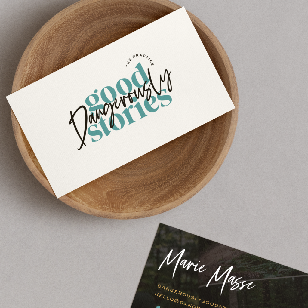
When you start adding in too many different things to your logo is when it starts to look cheap and screams DIY. A clean font-based logo – that’s where it’s at!
So there you have it! My top 5 Tips to a Successful Logo Design.

Do you already have a brand identity that you dig and are in really LOVE with?
Then I hope that these tips have given you a deeper look into what your current logo may be saying to your potential clients and how you might be able to make it even better.
But, if you are just starting to design your own logo I hope that this gives you the steps to take for you feel confident in your design and how to create a logo that will work best for your business.
However, if you are ready to dig deep with me as your guide and create a custom logo and comprehensive brand check out my “tailor-made” brand experience design service. Where I take you on an exciting brand adventure. We start with your brand foundation and then we add as much or as little as you’re looking for and that your business needs.
This could include brand collateral, like welcome packets or stationery. A brand new website with messaging that attracts your very own dream clients. It is truly tailored to your budget and your needs.
Not only will you have a new brand that shows your heart and style. You will know exactly how to use your brand, templates, or website without feeling like you need to hire a designer, every time you need to make updates. I make sure you are involved in each step of the process.

