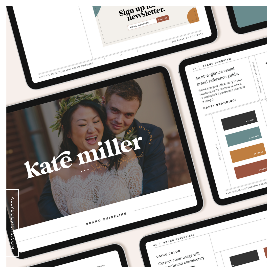
A bold and colorful wedding photographer website and brand project is the epitome of inspiration for me. I’m not one to shy away from color and I love a client who knows who they are and are ready to step forward with that same confidence in their brand. Kate with Kate Miller Photography was a dream to work with and I’m not sure I will even be able to find the words to bring justice to her talent but I’m sure going to try.
When Kate reached out initially to begin the conversation about working together she told me she had been in business for over 4 years and never felt like her brand was 100% right for her. She was ready to level up and invest in something that felt right and she could be confident in.
Now as you know – a brand to be confident in – that’s my JAM! I couldn’t wait to get started working with Kate not only because she is the most amazing human but also because the brand inspiration she shared with me from the get-go was fantastic! I knew this was going to be a fun design project that was unique and exciting.
The custom wedding photographer website and brand package that I put together for Kate included:
- The Brand Foundation and Brand Identity Design
- Social Media Templates
- Custom ShowIt Website
- Album Guide Add-On Pages
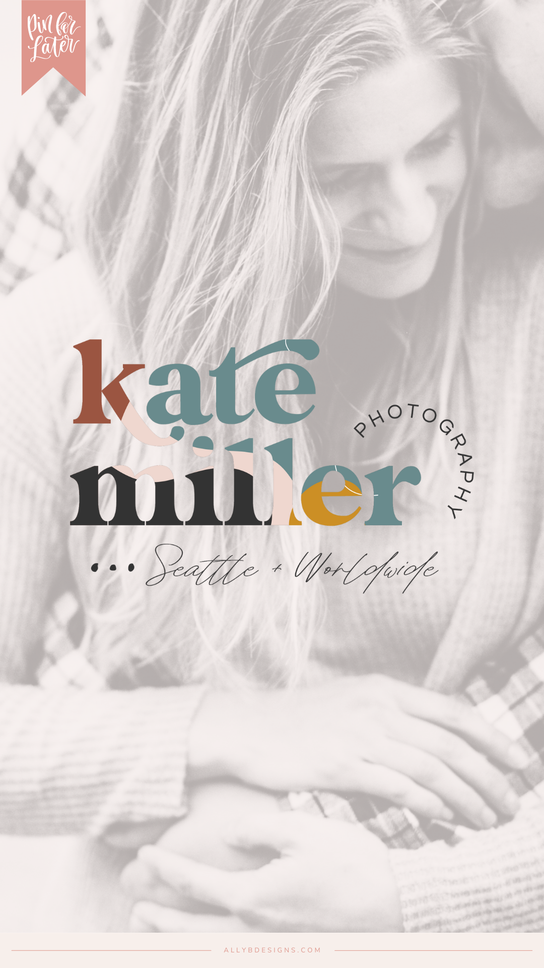
Step 01. The Brand Foundation and Brand Identity Design
The beginning stage of this project began with the brand foundation questionnaire and Pinterest board inspiration to be completed by Kate.
When reading through Kate’s questionnaire I was all in with the emotions she wanted to convey and the goals she had for her brand visually.
Kate wanted a brand that felt natural, meaningful, remarkable, and captivating. WOW! Digging into the psychology behind each of these emotions was thrilling because it aligned perfectly with what Kate was drawn to and shared within her Pinterest board creation.
Kate wanted a brand that was unique and she hadn’t seen before. She didn’t want to be seen with her competition she wanted to stand out and rise above them. Her brand goal was to catch the eye of her potential clients and get them hooked by her talent and elevated brand presence.
Before the rebrand, Kate said “I didn’t have a cohesive brand. I had never been able to land on a brand experience that I felt truly represented me and my business. It always felt not-quite-right.”
After the brand experience with Ally B Designs Kate had this to say…
“Seeing my brand identity come alive! I loved that Ally was able to take everything we talked about in the initial consultation and infuse my personality into all kinds of details. She is so talented!” – Kate
Check out the comprehensive brand design below.
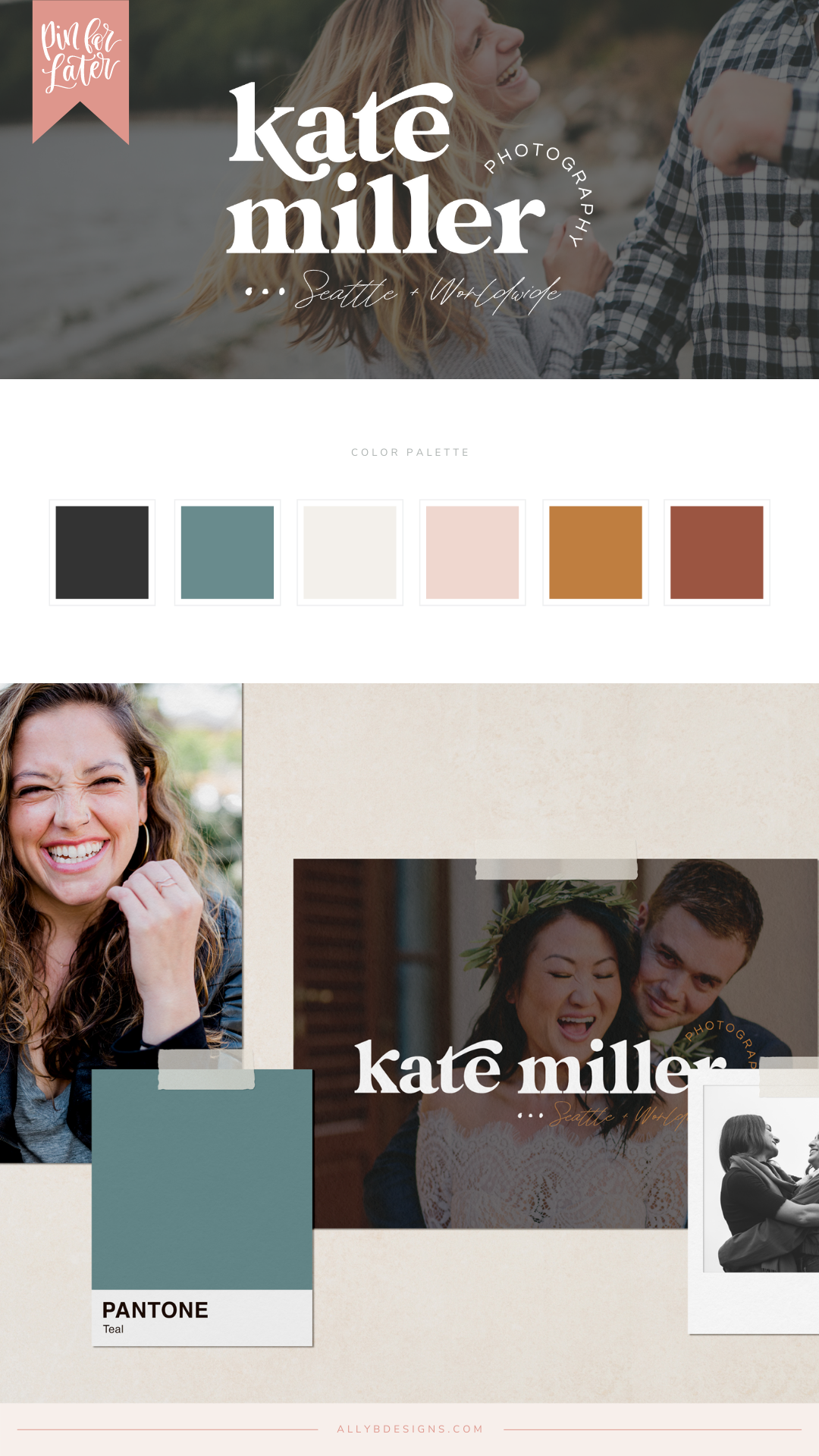
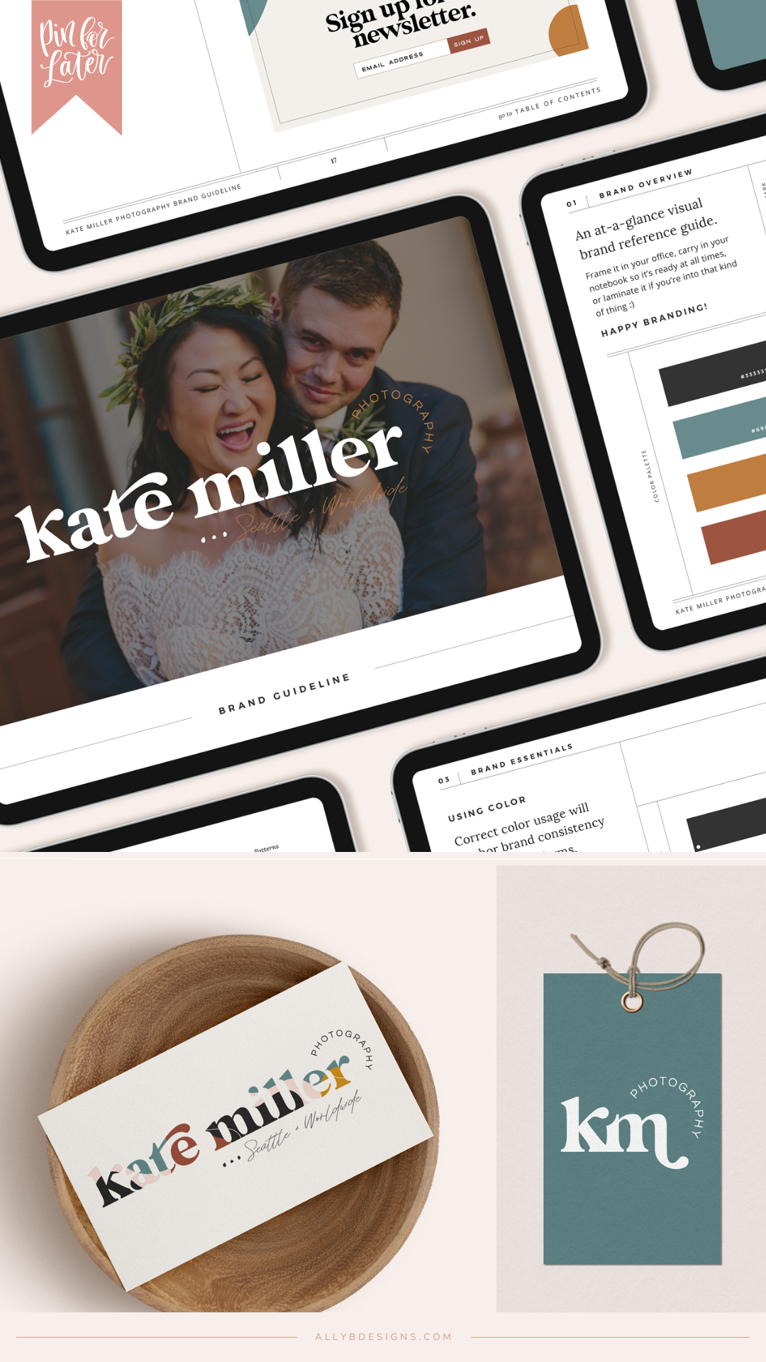
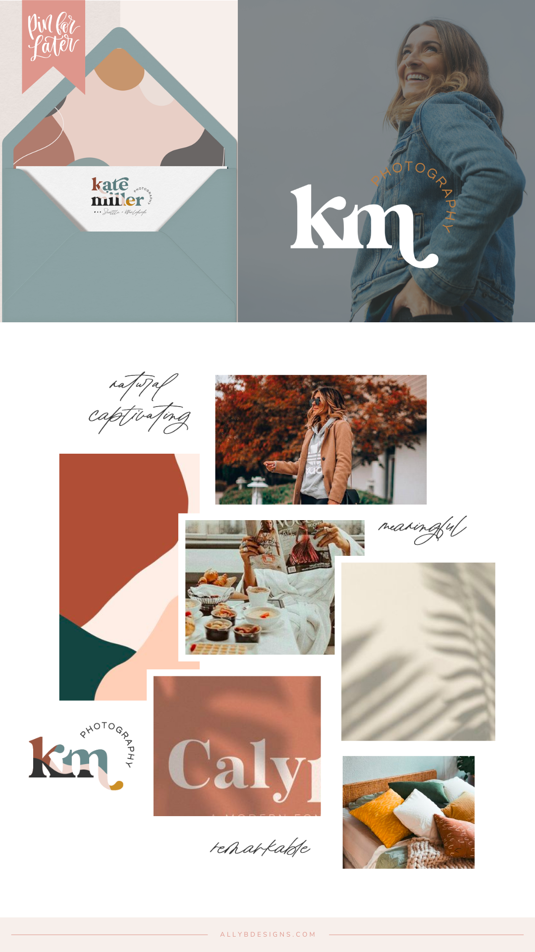
“I actually have a brand identity and a website that reflects my personality and how I want my clients to experience my services. It’s all actually aligned! I am so happy to be able to say that for the first time in 7 years of having a website, it’s finally something I am proud to show off.” – Kate Miller
Step 02. Marketing Materials and Brand Collateral
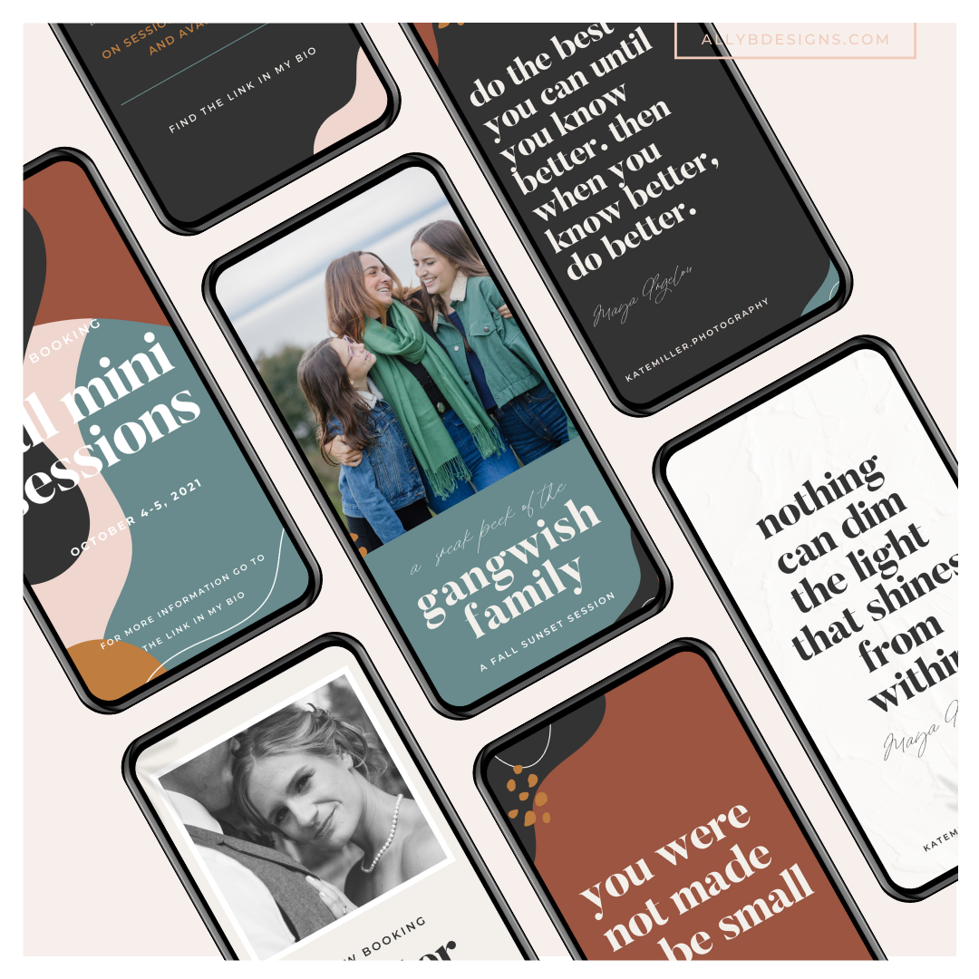
One of Kate’s top priorities was to create a consistent and cohesive brand experience. To create this well-rounded experience, I designed a set of social media templates for Kate to use on Instagram. Kate likes to have fun with Instagram and she wanted her brand to be just as exciting on social media as on her website. Creating a “peek” into what her site would be like allows Kate to create a conversation and journey that flows freely from one media to the next.
Step 03. Custom ShowIt Website
Getting to design a custom ShowIt wedding photographer website that showcases the extreme talent of someone like Kate is an honor. Her photography is stunning and captures the genuine love she has for her clients and to tell their stories.
Kate wanted a website that grabbed the attention of her potential clients and allowed them to get to know her as a photographer. She wanted them to trust her and understand her approach to sessions. As a photographer, you spend a lot of time with couples on their wedding day and have the opportunity to watch their family grow year after year. Kate wants lifetime clients because she cares deeply for each and everyone just like they are family.
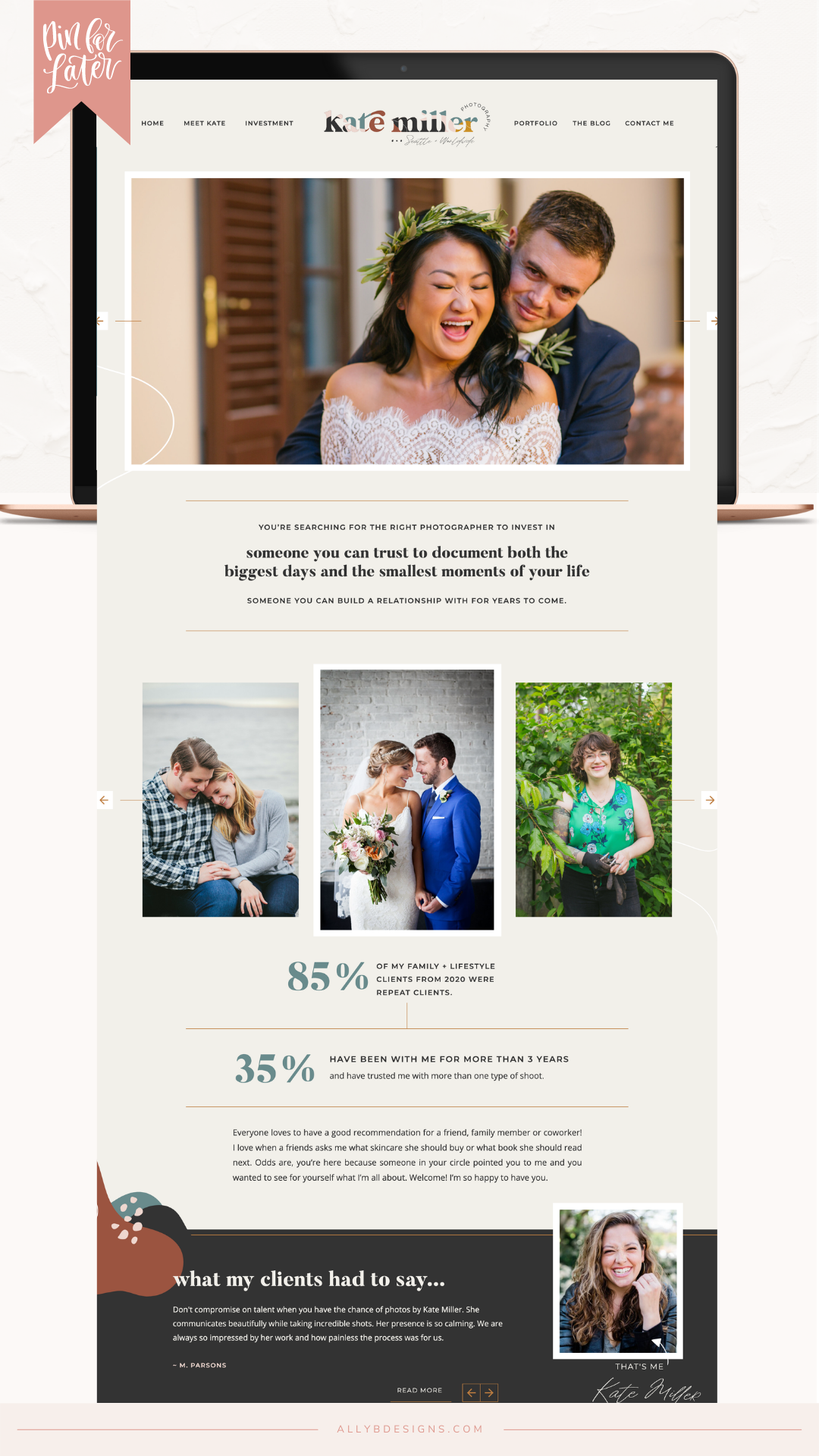
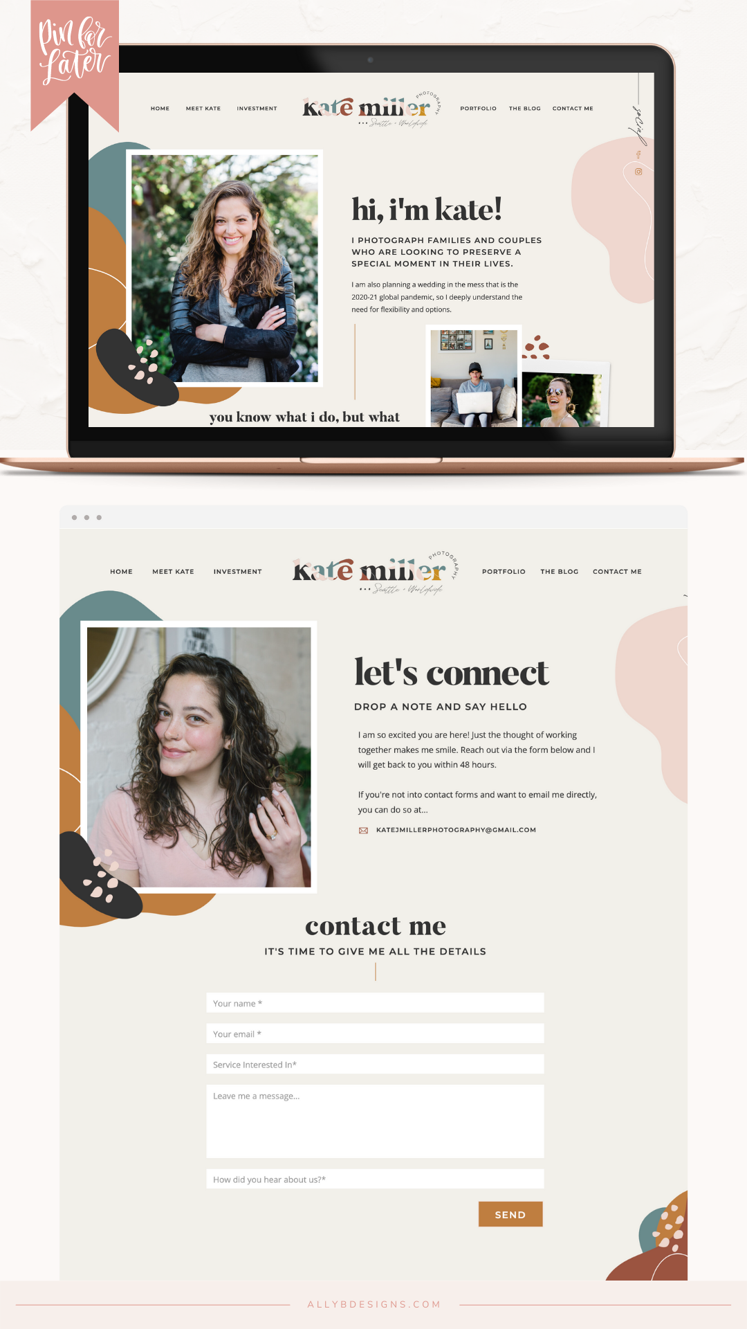
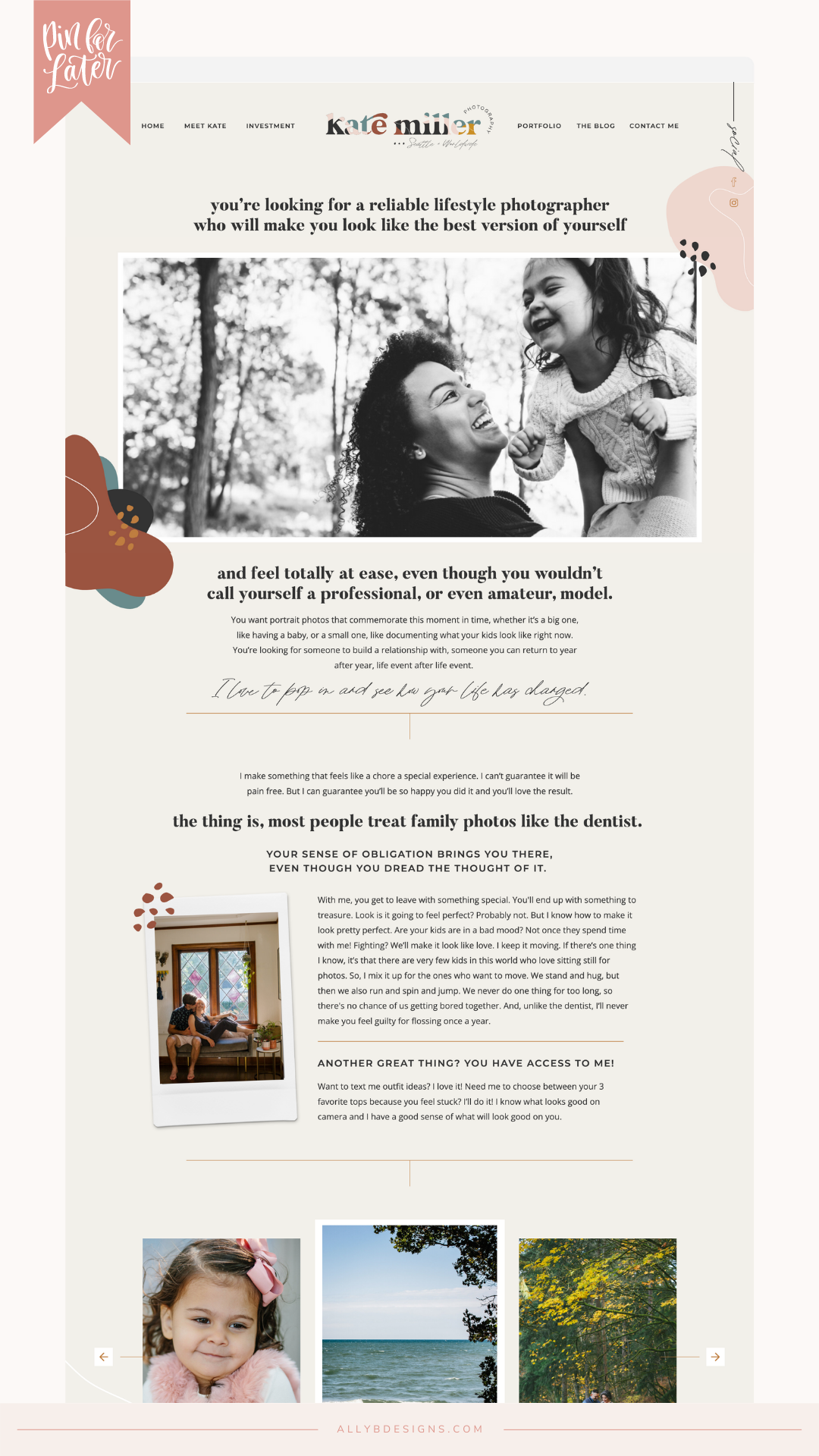
Her website was designed to be impressive and thrilling yet strategic and easy to use so her clients could find exactly what they needed and easily contact Kate to chat about scheduling their session. This strategy was extended into an album guide we created for her website. This allowed her clients to peruse the different styles of albums Kate could create for them and make decisions before even reaching out. Easy peasy! The way life is any more we need to go above and beyond for our clients and make it simple for them to choose us – that is exactly what Kate’s brand and website do.
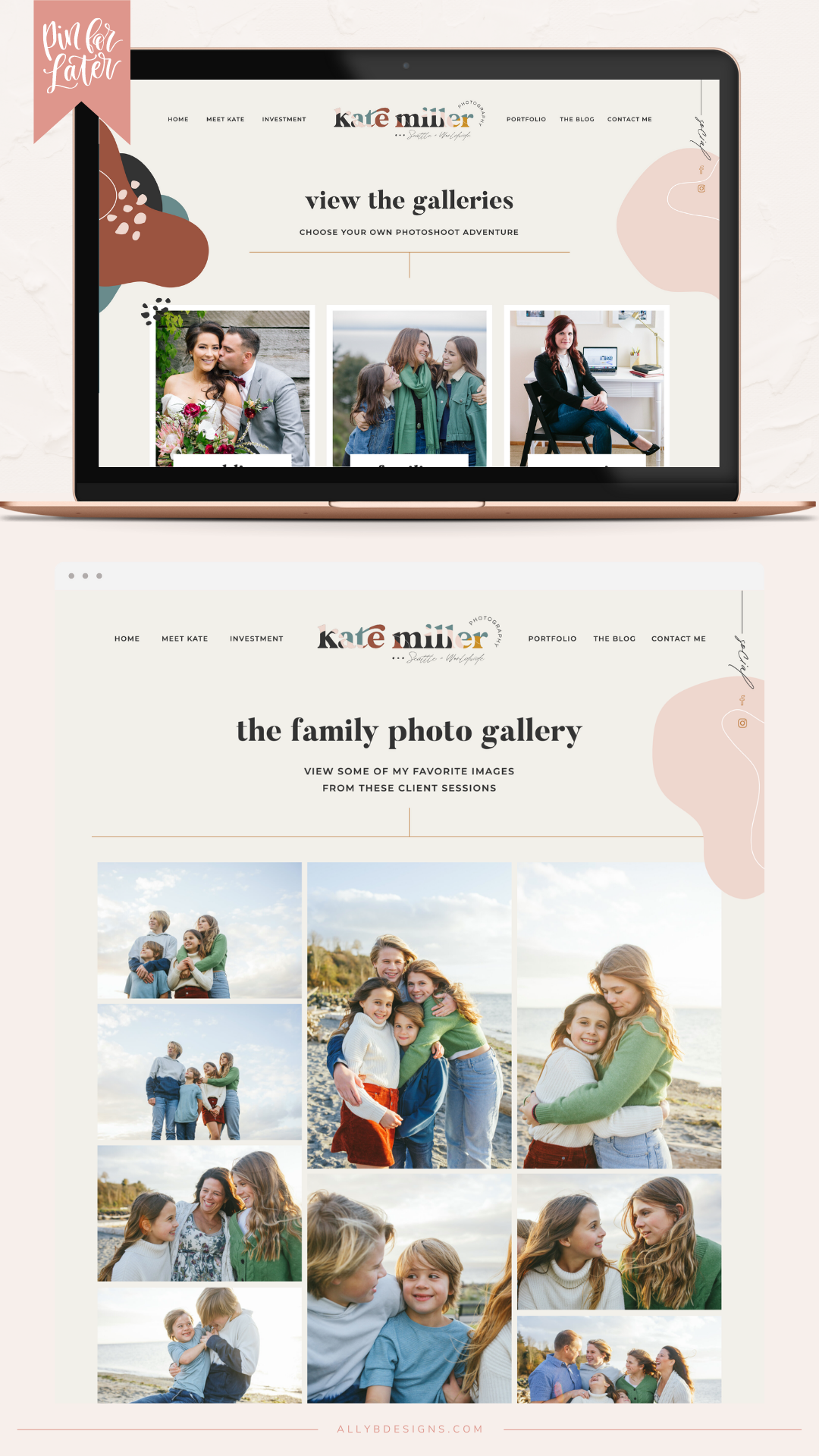
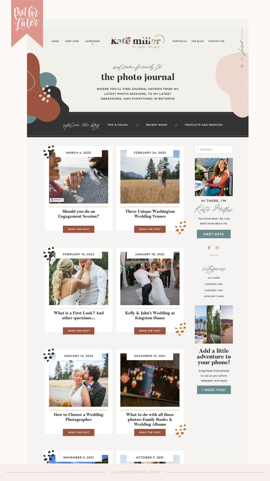
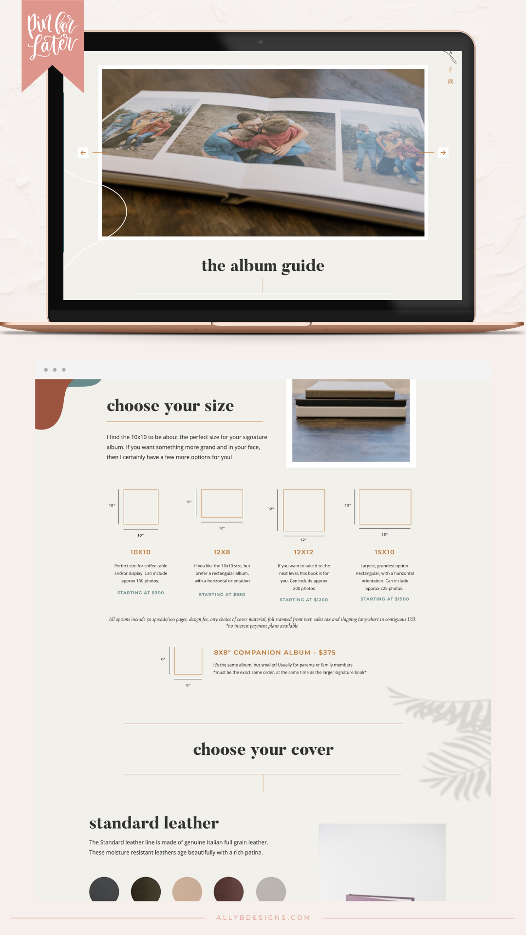
Since launching her website Kate said, “When we launched the site last summer, the response was overwhelming. People actually read my site and clicked through multiple pages and loved every piece of it! Clients compliment my website all the time.”
COULD YOU BE NEXT?
If you are ready for your very own “Profitable + Pretty Brand and Website” and have me as your guide, check out the Ally B Brand experience service. This is where I take you on an exciting brand adventure starting with your brand foundation. Then we add as much or as little as you’re looking for and what your business needs. This could include brand collateral like welcome packets or stationery, and a website with messaging that attracts your very own dream clients.

